Redesigning & Redefining BigID
Learning Management System
BigID LMS


5 Weeks
Internship
B2B
WEB
LMS
Redesigned the course overview and lesson pages to create a clearer, more motivating learning experience.
The original system was complex, overloaded with decisions, and lacked a structured framework for motivation.
What
I focused on designing two key screens in BigID’s Learning Management System (LMS):
01 A new Course Overview Page
02 A redesigned Lesson Page
These two pages form the core of the user’s learning flow — from understanding what a course includes to navigating through its content.
before

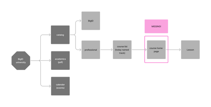
from: course list

straight to: lesson page
main problem:
Missing structure -
No Course overview page
A place where the learner can set up their course preferences, get a glimpse of what’s ahead, and feel motivated to begin.
main change:
New course overview page & restructured lesson page
01

new
Course
page

02
restructured
Lesson
page
01
Course
Overview page
A new Course Overview Page that introduces the course, sets expectations, and provides a clear starting point.
The main offer is a three clear course types to reduce cognitive load. A sticky cart stays visible during scrolling, allowing users to add and compare options effortlessly.


Designed to minimize choice overload while highlighting key details like course format, duration, and learning type. Helps users quickly understand what they’re signing up for.


Information is revealed gradually: users first see duration, number of units, and a progress bar. Once expanded, they can view lesson details and even take the lesson independently.
.png)
I used a familiar “shopping cart” pattern from e-commerce to help users select a course package, review all key details — like total duration and cost — before enrolling
Lesson Page
02
The redesigned lesson page introduces structure and clarity to the learning experience. Unit types are visually and functionally separated, creating a clearer sense of flow and hierarchy—from essential content to optional extras. The design supports motivation, ease of navigation, and a sense of progress.

A fixed sidebar allows users to easily navigate between lessons and units. The side bar is devides into 3 parts - Before you start, core units and
additional units.

Each unit displays its type, estimated duration, and a circular progress bar—providing instant clarity and reinforcing a sense of accomplishment throughout the lesson.
A persistent badge at the bottom reminds users of the course certificate as a motivator.


Hovering reveals a progress tracker showing how far the user has come
within the course structure.

Supporting materials that apply to the entire lesson are shown first at the top of each lesson, and remain accessible through the sidebar at any point.
Why
3 Key Findings
Users jumped straight from the course catalog to individual lessons, with no overview page to give context or show progress.
Missing Structure
Inside each course, users faced too many unstructured options, making it unclear what to focus on or what was mandatory.
Too Much Choice
The lack of a central course hub created a disconnected experience that didn’t support continuity or build commitment.
Fragmented Flow
How do we know that?

Comparative Analysis
Reviewed 10+ learning platforms including Coursera, Udemy and Wiz, and Showpad to extract structural and interaction patterns.
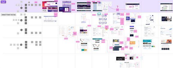

a messy process that led to clear conclusions
Defining Values & Principles
Before designing, we extracted core values from research and translated them into design principles.
Values
Principles
-
Progressive Disclosure
-
Minimal Cognitive Load
-
Responsive Design
-
Clear Information Hierarchy
-
Learnability & Discoverability
-
Inclusivity & Accessibility
-
Usability & Simplicity
-
Engagement & Motivation
-
Efficiency & Productivity
-
Scalability & Flexibility

Practices
Values
Principles
Desicions
Current Course Structure

Research SourcesLMS Platform Audit – Deep dive into BigID’s current LMS architecture, navigation, and page design to uncover friction points and gaps.

A re-definition of the course page through a four-step process:
How
01
Where / Why
/ Knowledge (UX Definition)
03
Wireframing & Feedback (UX Design)
02
Box Model (UX Structure)
04
Visual Design (UI)
Who / Were / Knowledge
(UX Definition)
01
For each page, I mapped:
-
Who are the users
-
Where they are coming from
-
What knowladge do they have

This helped define the user need of each page and identifie the course overview as an onboarding and orientation space, and the lesson page as a focused, linear learning experience.
Box Model
(UX Structure)
02
I built low-fidelity "box" layouts to focus on user needs, not UI elements.
On the course page: boxes for goals, time estimates, lessons list, and entry point.
On the lesson page: boxes for lesson content, notes, progress, and navigation — all before choosing visuals or hierarchy.
Wireframing & Feedback
(UX Design)
03
Once the structure was clear, I moved to wireframes.
The course page featured a modular layout with clear CTAs and entry points.
The lesson page introduced consistent navigation, collapsible sections, and a calmer reading experience.
These were shared for feedback and iterated with mentors and stakeholders.

Visual Design
(UI)
05
Using BigID’s design system, I applied visual consistency across both pages.
Typography, spacing, and color were chosen to support clarity and motivation, not overwhelm.
The final mockups were part of the clickable prototype presented to stakeholders.
